
Consent Manager
A consent manager is the consent banner published on the career page. It is created and published from Career Page > Consent Manager, and customised on its own screen: the Theme next to the Popup, Modal, Trigger and Purposes tabs.
The banner decides what runs for a visitor. A visitor agrees per purpose, and the services inside a purpose only run after that. So what your dashboards can count depends on what visitors agreed to.
Relations
- Career page — the banner appears on it, but is published separately.
- Account — a connected advertising account becomes a service under Marketing.
- Conversion — what a channel can report depends on consent.
Creating a consent manager
To put a banner on your career page, create a consent manager.
- Open Career Page and select Consent Manager.
- Select Create version.
- On Template, pick Blank Template or Copy from Source.
- On Details, fill in the Name and a Description. A new banner is written in the company's language; a copy takes over the languages and translations of its source.
- Select Create Consent Manager.
The consent manager appears in the list as Draft.
Customising the banner
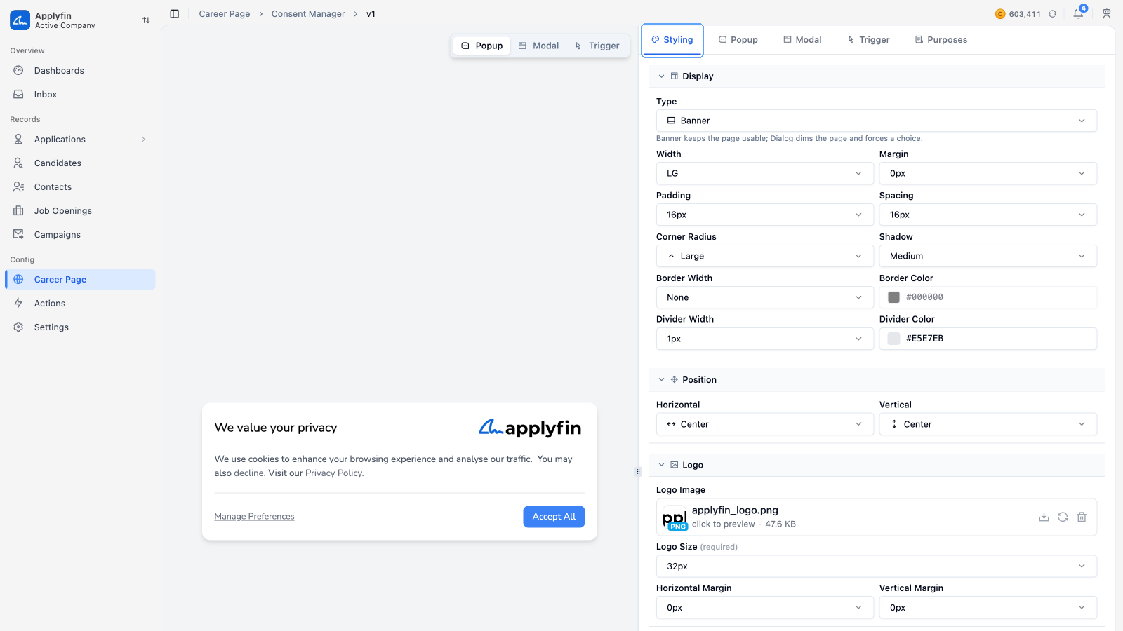
To change how the banner looks and what it says, customise it.
- Open Career Page, select Consent Manager, then select Edit.
- Select the tab you want to change.
- Edit its fields.
- Select Save in the bar above the preview, or keep going: your changes save on their own.
The preview sits next to the tabs: Theme, Popup, Modal, Trigger and Purposes. The bar above the preview switches it between the Popup, the Modal and the Trigger, and holds Save. The preview shows the part you are editing, so you see the change before you save it. Once your career page is published on an active domain, the preview draws the banner over the live page, so you can judge colours and placement against your real content.
The Theme is shared by the popup and the modal: the logo with its Logo Size and Logo Margin, the colours, the Heading Fonts and Body Fonts, the Heading Size and Body Size, the Border Width and Border Color, the Shadow (None, Soft, Medium or Strong) and the Shadow Color. The trigger gets the same border and shadow. The logo sits on the right of the title. A negative logo margin pulls the logo toward the edge.
Pick the Logo Image from a public folder in your asset library, normally Logos. Select Upload in the picker to add a new one. Without a logo, the banner shows a cookie icon.
A new consent manager starts with the fonts of the company theme. Without body fonts the banner uses the page's font, and without heading fonts the titles use the body font.
To change the theme without opening the editor, open the menu of a draft version in the Consent Manager list and select Theme. Select Save to apply it.
The popup and the modal each have their own Layout, at the top of their tab:
- Type — a non-blocking banner, or a dialog that dims the page.
- Position — where it sits on the page: click a spot in the small grid, or pick the horizontal and vertical side from the two menus next to it.
- Size — its width and height. Clear a value, or select the button at the end of it, for Full width (as wide as the screen) or Auto height (as tall as its content). A fixed height scrolls the content inside it. On a phone it never gets wider than the screen.
- Padding and Margin — the space inside it, and between it and the screen edges.
- Corner Radius — 0 to 24px. The panel's corners; the boxes and chips inside follow it.
- Button Orientation — how its buttons and links sit: Row, all in one row (the buttons share the width left by the links, and a label too long for its share is cut off), or Column, one per row, links included.
- Button Gap — the space between its buttons and links, 0 to 32px (8 by default), side by side in a row or between the rows of a column.
- Button Radius — the corners of its buttons, 0 to 28px (8 by default). Half the button size or more gives round ends, and at 0 the corners are sharp and the labels bolder.
- Button Size — the height of its buttons, 28 to 56px (36 by default). The label size and padding grow with it. Links and inline links keep the text size.
- Button Width — the width of each button, 64 to 400px. Leave it empty, or select the button at the end of it, for Fill: the buttons share the row, or take the full width in a column, as they do by default. A set width still shrinks to fit a narrow panel or a phone.
- Button Alignment — next to the orientation: Left, Center, Right or Between, where the buttons and links sit in their row or column. Between is the default and spreads a row from edge to edge; in a column it reads as Left. With Fill the buttons leave no room, so it then only moves the links in a column.
Padding, Margin and Logo Margin each set a value per side, top, right, bottom and left in one row. The link button at the end sets all four at once. Type a value, use the arrow keys (hold Shift for steps of 4), drag the small box in front of a value sideways, or drag the arrows at the end up or down to change all sides together.
The tabs cover the rest.
- Popup — its layout, the Title, the Description and the Accept All, Decline All, Manage Preferences and Privacy Policy buttons. Each button has a Type (Solid, Outline or Ghost button, a Link under the buttons, or Inline in the description text), an optional Color (without one it follows your accent colour), and Bold, Italic and Underline toggles beside its label. Drag a button by its handle to change the order: in a row the first is on the left, in a column it is on top. Links take their place in that order too, and inline links follow it in the description. A button you remove moves below the list; added back, it takes its usual place, and you can drag it from there. Accept All can't be removed.
- Modal — the preferences screen, its layout, the Save Preferences, Discard and Privacy Policy buttons, reordered and removed the same way. Save Preferences and Discard can't be removed.
- Trigger — the small control that reopens the banner after a visitor has answered it: its icon and Icon Size, its Corner Radius (0 to 36px; half the button's size or more makes it round, as it is by default), its Position (any corner, edge or the middle, picked the same way as the banner's position), whether it's Visible at all, the Padding around the icon and the Margin to the screen edges. The button is as big as the icon plus its padding.
- Purposes — the purposes and services the banner asks consent for, covered under Purposes and services.
Purposes and services
A purpose is a category a visitor agrees to. Each purpose holds one or more services. A service is the thing that actually runs, such as a tracking script.
Three purposes are built in and marked Locked. You cannot delete them or change their IDs.
- Essential — required for the website to function, including remembering consent choices.
- Analytics — used to understand how visitors use the site.
- Marketing — used to measure and improve advertising campaigns. It only appears once an advertising account is connected.
Adding a purpose
To ask visitors for consent for something else, add a purpose.
- Open Career Page, select Consent Manager, then select Edit.
- Select Purposes.
- Select Add Purpose.
- Fill in the Purpose Title. The ID is filled in from it.
- Fill in the Description.
- Select Add Service.
- Fill in the Service Title. The ID is filled in from it.
- Set Default if the service starts accepted.
- Set Required if it must always be accepted.
- Select Save Changes.
The purpose now appears on the banner for visitors to agree to.
Advertising channels
You do not add tracking for advertising here. Connect the advertising account under Settings > Accounts, and Applyfin adds a service for it under Marketing automatically, named after the channel.
Applyfin connects Google, Meta and LinkedIn. Connecting one is covered under Accounts.
Translating the banner
The banner is written in one language and can be shown in more.
- Open Career Page and select Consent Manager.
- Select Translations on the consent manager (read-only on the published one). In the customiser, the translate button in the preview bar opens the same page.
- Select Add locale next to the search and pick a language.
- Fill in the column, or select Translate on it.
The table lists the popup and modal titles and descriptions, the button labels, the all-services switch, the updated-at label, and every purpose's and service's title and description. It works like the career page's, see Translating a version.
Publishing the banner
To put the banner in front of visitors, publish it.
- Open Career Page and select Consent Manager.
- Select Publish on the consent manager.
- Confirm on Publish Consent Manager.
The banner now reads Published, and visitors see it on your career page.